Getting your Trinity Audio player ready...
After the new logo of Israel's National Library provoked many negative reactions across social media, on Sunday the library announced the return of the design of the previous logo.
Read more:
"A few days ago we decided to change the logo and upload a new symbol. The change sparked an important and wide-ranging public discussion," the National Library wrote in a statement posted on social media. "This discussion testifies to the emotional and strong connection between the public, in all its varieties, and the National Library. We recently held discussions in which we considered the various opinions and reasons that were voiced, and decided that the library will return to its previous symbol."
3 View gallery


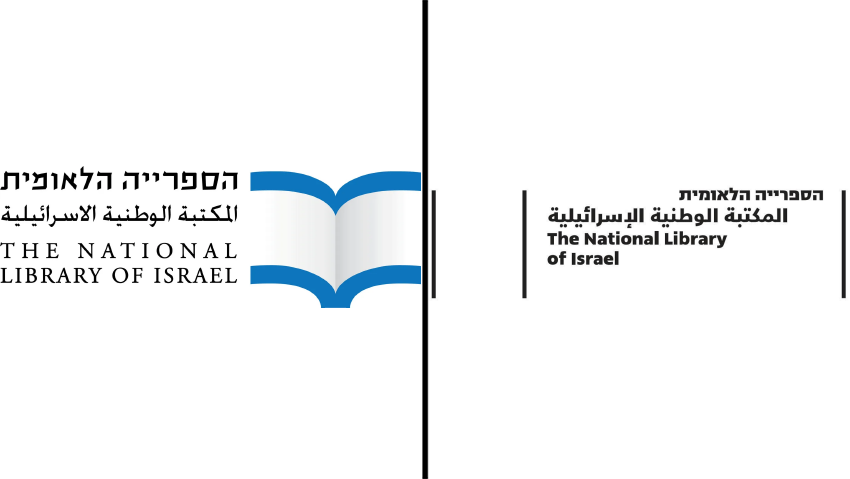
Old and new logos of the National Library of Israel
(Photo: Courtesy of the National Library)
In addition to the reactions online, earlier on Sunday Minister of Education Yoav Kish sent a letter to the National Library in which he implored it to return the old logo, and wrote: "Section 3 of the National Library Law establishes the goals of the library: 'The goals of the National Library are the collection, preservation, cultivation and inheritance of treasures of knowledge, heritage and culture in general, and in relation to the Land of Israel, the State of Israel and the Jewish people in particular. The previous symbol of the library presented the relationship between the National Library and the State of Israel, Zionism and the Jewish people in a way that reflected and instilled the culture and heritage of the Jewish people: The symbol presented a white book with light blue edges - in a way reminiscent of the colors and shape of the country's flag, while the light blue stripes on it also symbolize the tallit used by the Jewish people for prayer for thousands of years. Also, the previous symbol gave a place of honor to the Hebrew language, which is the language of the state and the language of most of the writings found in the National Library.
"In contrast, the new symbol of the National Library is cut off from any connection and identity with the Jewish people, the State of Israel, Zionism and the Hebrew language. In the new symbol, the Hebrew language is no longer prominent and central. In addition, the blue stripes and colors reminiscent of the state's flag have been deleted," Kish wrote.
The letter also emphasized that, although the State of Israel is the largest funder of the library, it is prohibited from interfering in its decisions, but added that "at the same time, it is not possible for the National Library to carry out moves that harm the public's trust in the library, and erode the relationship between the National Library and the State of Israel, Zionism and the Jewish people."
In his letter, Kish asked to receive the minutes of the board meeting where the new symbol was approved, the names of the board members who voted on the issue and the names of all the employees of the National Library who were involved in planning and making the decision on the new symbol, and the cost of contracting for the design and its creation."
The controversy comes after the National Library last week launched the new logo on its Facebook page - a move that provoked many negative reactions that ranged from bewilderment to anger. Many argued that it was anemic and lacked any distinctiveness, and some critics complained that the logo did not contain any national symbols.
"What a complete disconnection from the State of Israel and the people of Israel. There is no national symbol in the name (not even in color), and the name in Hebrew is the same size as the name in Arabic and English (that is, Hebrew becomes just another language).The symbol is disconnected, cold and alienated, lacking identity and emotion, and without any unique or national meaning," responded a surfer named Omar. "There is no recognition that this is the logo of the National Library of Israel. At least it was in the previous logo. A mistake and a shame," added the commenter ElRoi. Surfer Keren wrote that the matter "is a pity and sad. From a logo with meaning and a statement that distinguishes the place, you have moved to a generic logo that is not clear what it wants to symbolize and above all it is not clear why to change what is good and works."
The logo that was published for the first time was black in contrast to the previous blue and white logo, which caused the National Library to publish on the networks a reference to the criticisms and clarify that the official symbol remains blue and white, like the colors of the Israeli flag, but to no avail. Many also lamented that the new proposed logo did not have a special status for the Hebrew language compared to Arabic and English, and the size of the inscription in the three languages is the same.
"Hebrew has been lost, and the lines are not clear either. You don't need to innovate all the time. You are responsible, among other things, for preserving the past - keep it...", commented surfer Oded. "Your intentions are beautiful, the execution shows otherwise. It's not just the color, it's the lack of prominence of the Hebrew language (and what was wrong with the previous, special font?), it's the disappearance of the book that alludes to the People of the Book, the disappearance of the allusion to the flag, to the tallit. You have emptied the symbol of all nationalism, Zionism and identity. You turned it into nothing," shared surfer Renee.
The library announced Sunday that it will return to the previous logo, which presents a blue-and-white illustration of two lines simulating a book.


