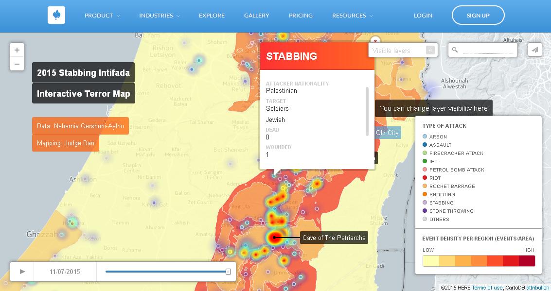
The development of the current terror wave that has enveloped Israel and the West Bank has been charted through an interactive map, created by political analyist and freelance strategist Nehemia Gershuni-Aylho and Judge Dan.
Gershuni-Aylho, who refers to the current wave as a "stabbing intifada," and whose statistics on the burgeoning violence start as of September 6, has sorted the incidents by date, type of event (e.g. stabbing, stone-throwing) and location. Additionally, the density of events per area and time appear as a "heat map" which ebbs and flows as the map moves through the weeks. This allows the map's users to track the main centers of violence and trace how the hotspots have shifted as time has gone on.
For example, while the West Bank and Jerusalem have consistently remained deep red, meaning that they have witnessed constant high levels of violence over the past two months, one can see how the number of incidents in central and northern Israel, for example, has gradually waned during the last couple of weeks.
The data sets that Judge Dan mapped are also available to the user. Here, the breakdown of incidents goes even further - one can see, for example, whether the attacker was Palestinian, Israeli-Arab or Jewish, or where they were from. The target of the attack - Israeli police, civilians, soldiers - has also been logged.
According to Gershuni-Aylho's Twitter feed, the map has already been viewed 18,000 times. It continues to be updated on a daily basis.


