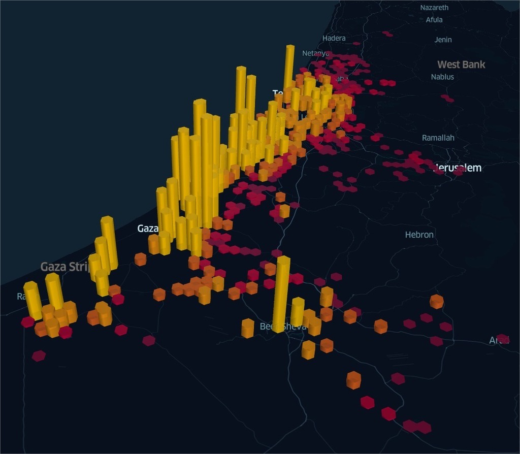
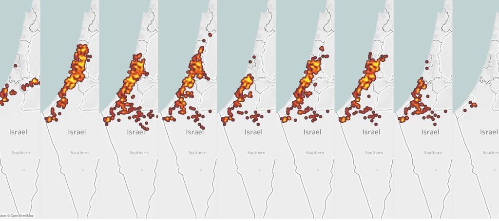
A chilling new online simulation illustrates the intensity of the rocket fire the State of Israel has been subjected to since the beginning of the current round of cross-border violence against Gaza Strip terrorist factions and shows which cities have suffered the most.
A video based on the mapping of Home Front Command's rocket alerts shows the countless locations that have been targeted on a map of Israel, day by day and hour by hour from the first rocket launches on May 10 until Tuesday morning.
Locations targeted by Gaza rockets
(Simulation: Yoav Tepper)
In some cases, a single rocket can set off alerts in several areas, so the map may show more warnings than the actual number of launches.
The analysis is based on information that is available to the public and the animation is not updated in real-time so as not to help Hamas improve its accuracy.
The simulation was created by data scientist Yoav Tepper who initially shared it with a group discussion on Reddit.
Speaking to Ynet, Tepper said that his post led to a heated debate between supporters of Israel and supporters of the Palestinians, a debate that completely deviated from the original discussion about data processing and graphic presentation.
Tepper is a software developer and describes himself as a fan of data projects.
"I find it interesting to look at the data behind the events," he said, preferring to leave the security or political implications of his work to others.


